MY ROLE
Product Designer
Information Architect
UX Researcher
DURATION
The Problem
10 Weeks
TEAM
CONTEXT
KBCS FM’s website struggled with confusing navigation, cluttered content, and poor accessibility, making it difficult for users, especially older listeners, to discover programs, donate, or engage with the station’s community-driven offerings.
The Outcome
A redesigned website with simplified navigation, improved content hierarchy, and accessible design that makes listening, donating, and exploring programs easy and intuitive, while staying true to KBCS’s community-first identity.
1 Designer
1 Engineer
1 Manager
RESEARCH AND DISCOVERY
Identifying the Existing Issues
I started by understanding why users struggled with the current KBCS website, uncovering usability gaps, navigation pain points, and barriers to engagement.
METHODS


DISCOVERY
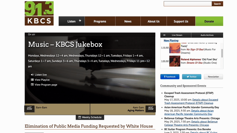

Overwhelming and Hard to Navigate
The site’s dense layout and lack of visual hierarchy made scanning difficult, especially for older audiences who needed more clarity and simplicity.
Understanding the Stakeholder Needs

KEY TAKEAWAYS
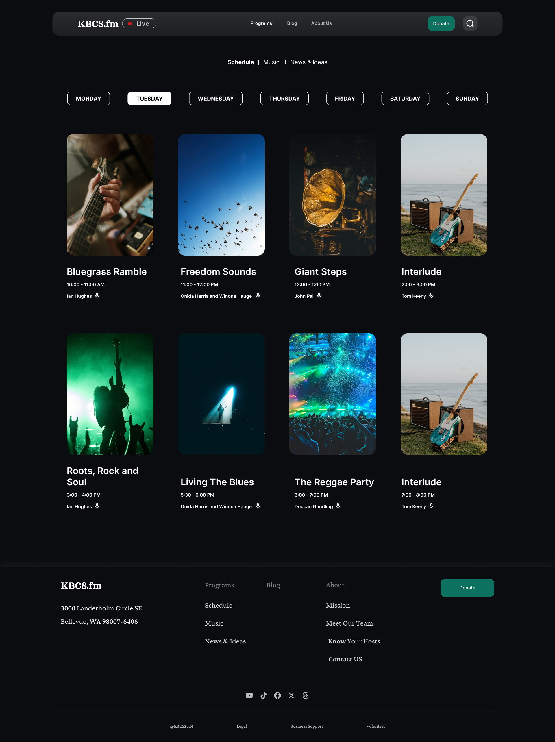
SIMPLIFYING THE NAVIGATION


Poor Information Architecture
62% of the usability study participants failed to locate program archives due to poor information architecture (through the survey, it was found that users primarily visit the website for program archives).
Donation Flow Felt Untrustworthy and Unclear
The donation process lacked visibility, clear messaging, and trust signals. Users felt unsure whether their contributions were secure or impactful, leading to hesitation and drop-off.
Beyond user frustrations, it was essential to understand what KBCS as an organization wanted to achieve through this redesign, balancing community impact with operational goals. I conducted a workshop with the stakeholders to understand the business goals and priorities.

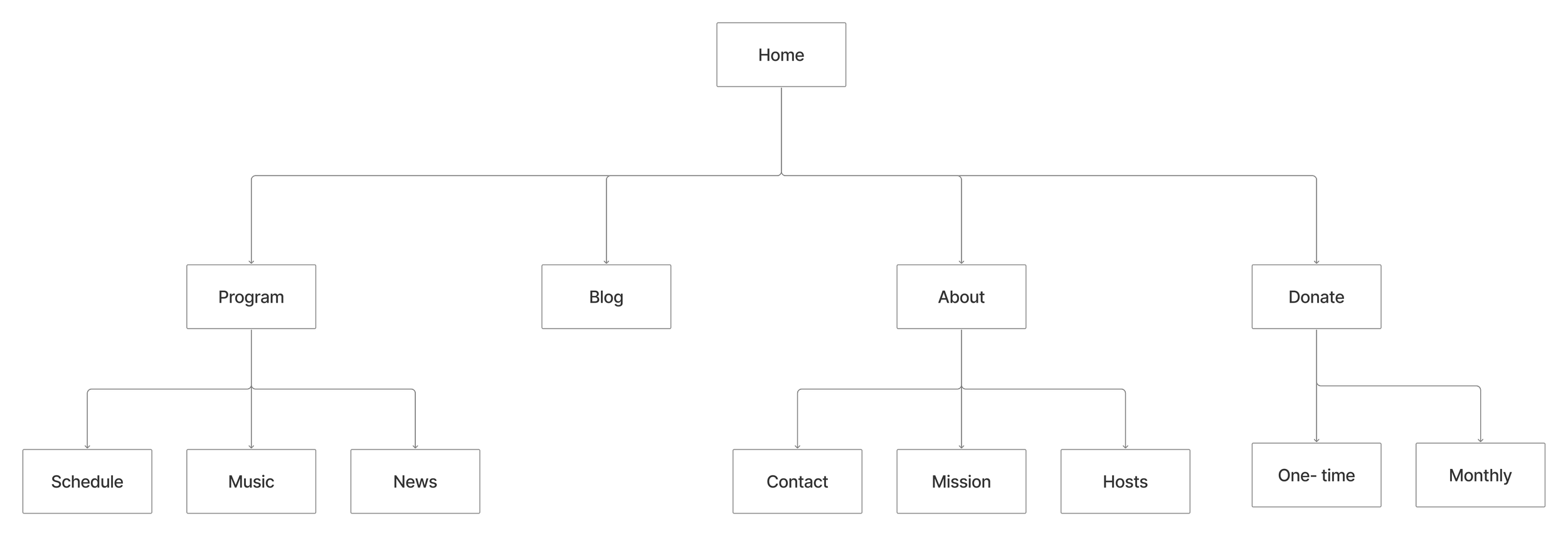
I conducted a card sorting exercise to understand how KBCS listeners naturally grouped and prioritized content. This helped me redesign the site’s information architecture, making essential actions like listening, donating, and exploring programs easier to find and navigate intuitively.
FINAL DESIGNS
After receiving feedback from the stakeholders on low-fidelity wireframes, I refined and finalized the new designs and prototyped the interactions.
LANDING SCREEN
DONATION
PROGRAM